ACE Institute of Technology started out as Ace Training Center in late 1990s. It made its transition to ACE Computer Training Center in early 2000s with this Logo.
![]()
![]()
The process of deliberation went a bit round about to come back to the pyramid that the originators of the school had already been using. This pyramid was part of a Pyramid Chart that illustrated the concept pitch of ACE as how the courses were designed to elevate a students candidacy to be unrivaled in the job market. Below are some of the ideas that we batted away.

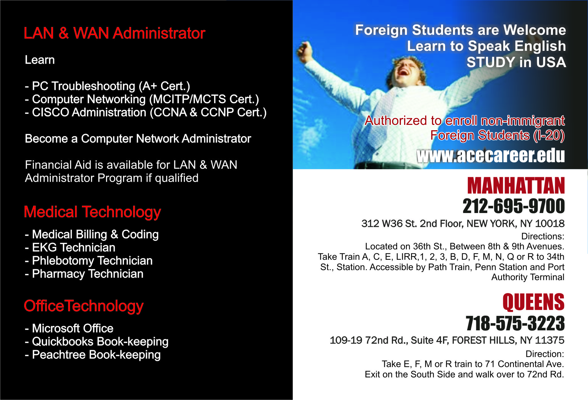
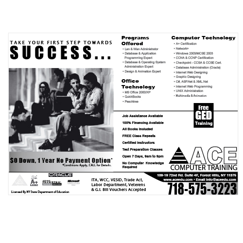
In those early days of this school, the company was not interested in the branding as much as attracting walk in traffic. Ads were going into the community News Papers and candidates were walking in with job opportunities on their minds. Here is one of the flyers they would find in the waiting room.
![]()
![]()
![]()
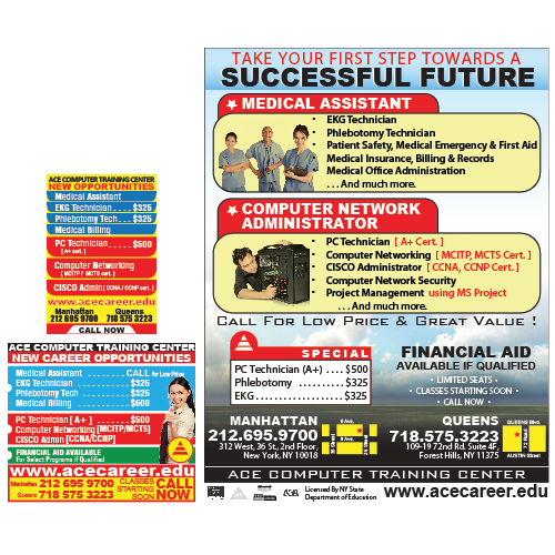
ACE’s marketing model remains the same but their success brought in a bit more budget and we were able to place ACE’s name into increasingly sophisticated venues. More flyers, more merchandise and an increased focus on expansion in both; the physical space and market visibility called for updating the “Look”. That was also the time when I took on the responsibility of ACE Brand from a leadership position and created majority of their brand assets and collateral. Below is the improvement on their Brand Identity in late 2000s.
![]()
![]()
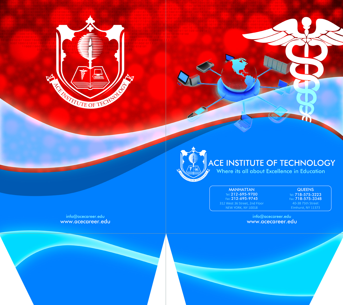
Even though, this improved brand identity was now in full swing – It was not that much of an improvement in company’s attitude towards branding and old model of trying to creep into the classified section of major newspapers was a good floating boat that no one wanted to rock. However, the business did expand and ACE now was a contender in the market. In early to mid 2010s ACE, due to its hard work and due diligence, was able to gain national accreditation. It was no longer a local computer training center but had earned the right to be ACE Institute of Technology. Now, it needed to look as such.
A re-Branding endeavor once again brought me into the leadership position and we were able to recreate the Identity of Ace Institute of Technology with its two prime locations, online presence and print collateral that was reaching Tri-State area. Below is the current logo.
![]()
![]()
Following is the gallery of initial sketches for the concept of ACE Institute of Technology.
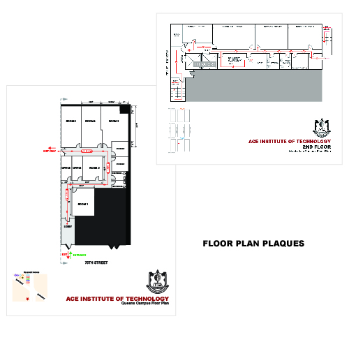
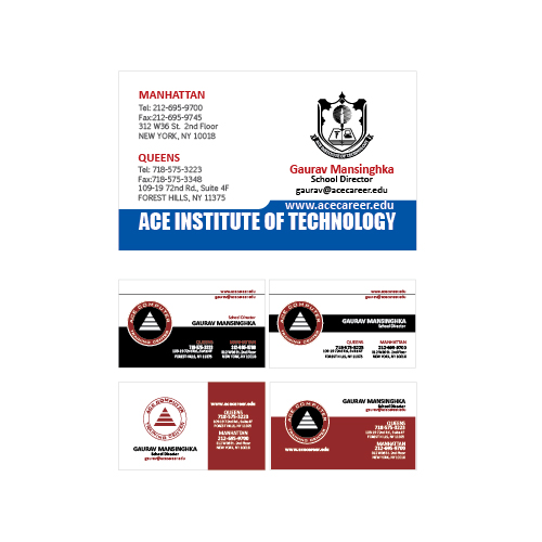
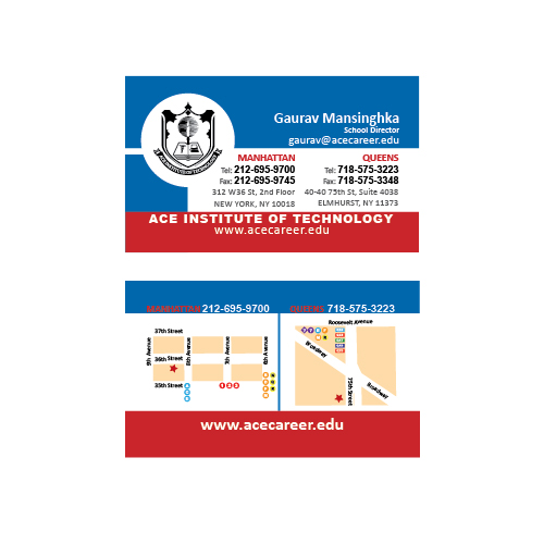
Following is the gallery of some of the print collateral and assets that I created over the years.


Bhaag Meray Jaani – Music Video
Saad Ahmad Khan | SAAD’STUDIO | OriginalSaad A story of survival during...

OriginalSaad – A Short Visual
A short visual piece by Saad Ahmad Khan (OriginalSaad), exploring identity, rhythm, and presence through original images and sound.

Moonshine Pistola — An Experimental AI Short Film
Moonshine Pistola is a short piece assembled using AI-generated imagery,...

Ramadan Mubarak

Building Creative Leadership Across Industries
Saad Ahmad Khan’s 25+ year career spans manufacturing, education, fashion, entertainment, and non-profit sectors — yet one trait is consistent across all roles: his capacity to lead from vision to execution.
Mar-Tech In Action
MAR-TECH IN ACTION Turning Data into Decisions. Tools into Impact. Over...

Commanding the Stage: Transforming Brookwood’s Trade Show Presence
Turning industrial booths into powerful brand stages that drove visibility, engagement, and conversions worldwide.
17 Years of Brand Stewardship: Evolving ACE Institute of Technology
Guiding a vocational school’s identity through two major redesigns and nearly two decades of growth.
Re-imagining Donor Engagement for a Global Institution
Translating complex academic research into emotional stories that moved global donors to action.
Weaving Tradition into Digital: Launching Brookwood’s First eCommerce Engine
Build Brookwood’s first in-house digital marketing function and launch a B2B eCommerce platform to expand revenue beyond traditional channels.

Brookwood Westridge™ – Fabrics for BackPacks

From Concept to Concrete: Bringing Brand Identity to Life in Gardena, CA
When Brookwood Roll Goods expanded its warehouse in Gardena, CA, the...
GALLERIES


0 Comments